The joy of graphs and reports on Ragic
When building database applications, one of my favorite moments is when you first turn tons of data into one beautiful, meaningful chart. It’s like when your eyes finally opened for the first time……”so that’s how our sales grew in the past three years!”
Visualization and reporting is one of the most important reasons why people would go through all this trouble to build an application and pour all their data into it. You can have numbers for each day, each week, and each month— all this detail, but you can’t see the forest for the trees. You might have some idea what product sells well and what doesn't. You may have an idea which ad campaign seemed to work better, but it’s not until you have a chart produced or a ranking report generated, that you get the clear idea of what’s going on with your business.
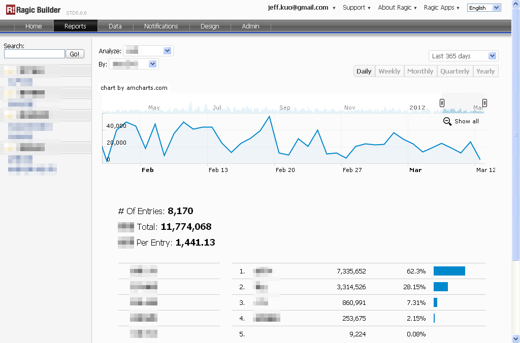
Creating charts from databases usually takes a lot of messy, labor-intensive work. Ragic says: “Let me do all your dirty work”. Ragic can generate a line chart based on any date field and number field on your sheet, according to the time range and aggregation level of your choice. Ragic can also create rankings and pivot tables along with it on any selection field of your choice. The field needs to be selection, otherwise there would be no basis to categorize your data on.
When you have some data in your application, just go to the “Report” tab at the top navigation bar, and choose a report for the form that you would like to view. If there’s no numerical field on your form, it will be analyzed based on how many entries for each category or time period. If there’s no date field, it will be analyzed based on entry creation date.
カテゴリ: Talking Ragic > Learn Ragic