When you have a large volume of sales orders and wish to create a monthly sales report to analyze sales figures such as: Ranking product performance, calculating sales across different channels, and evaluating sales representatives’ performances, Ragic’s built-in Reports can help.
These reports provide insights into your product sales, which can allow your team to make informed, data-driven business decisions. However, each type of report serves a different purpose. Which report is best suited for your business scenario? We dive into different types of situations and our recommended report types below:
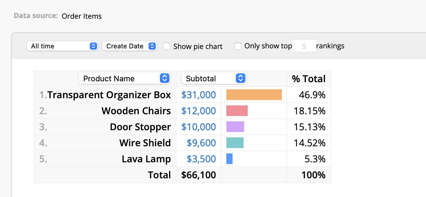
One of the most common ways to analyze "Sales Orders" is by ranking the products according to their volume of sales. This allows you to quickly identify the best-selling products and those that are less popular, which can help provide insights for product mix decisions and marketing resource allocations. For these types of needs, we highly recommend using the Ranking Report.
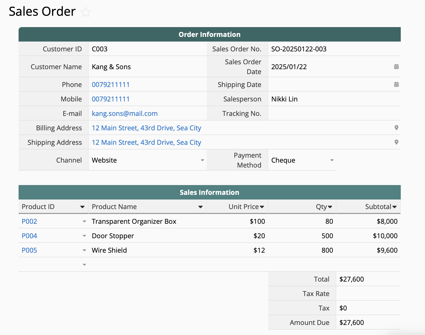
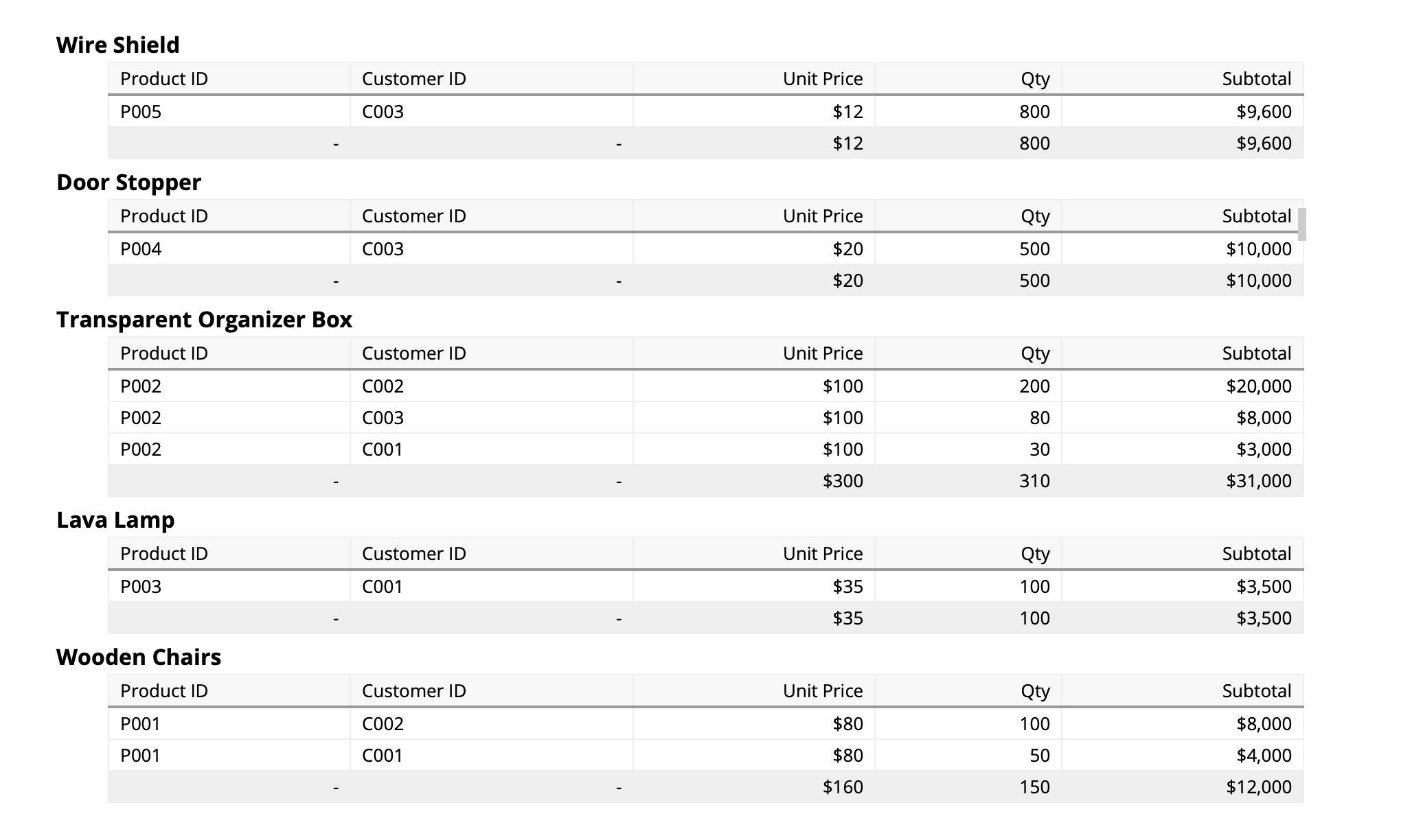
It is important to note that most "Sales Orders" store information on the number of items sold in Ragic’s Subtables like this:
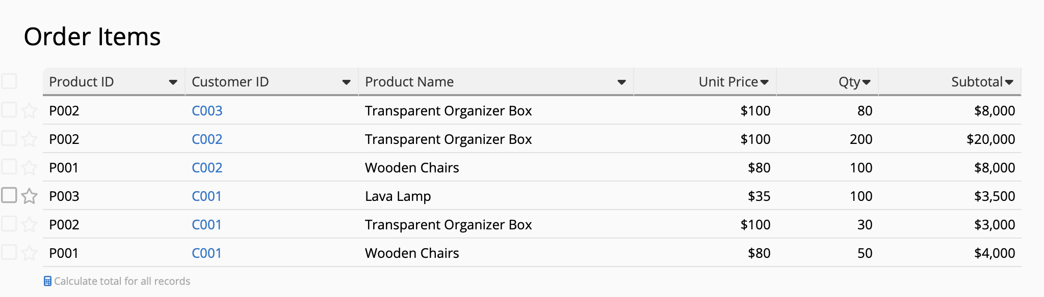
However, Ragic currently does not support generating reports directly from Subtable. Hence, you can first generate a New Sheet From Subtable. This converts each order item into independent records in the new "Order Items" sheet, where you can then create your Ranking Report.
If your "Sales Orders" data is already structured like the "Order Items" sheet where each record only contains a single product’s information, then generating a New Sheet From Subtable is no longer necessary.
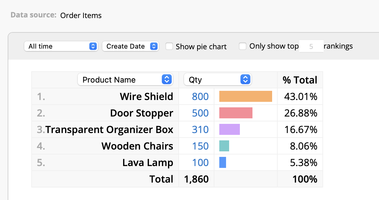
In this case, we’re analyzing the ranking of the "Product Names" based on their sales volume, so we proceed with the following settings:
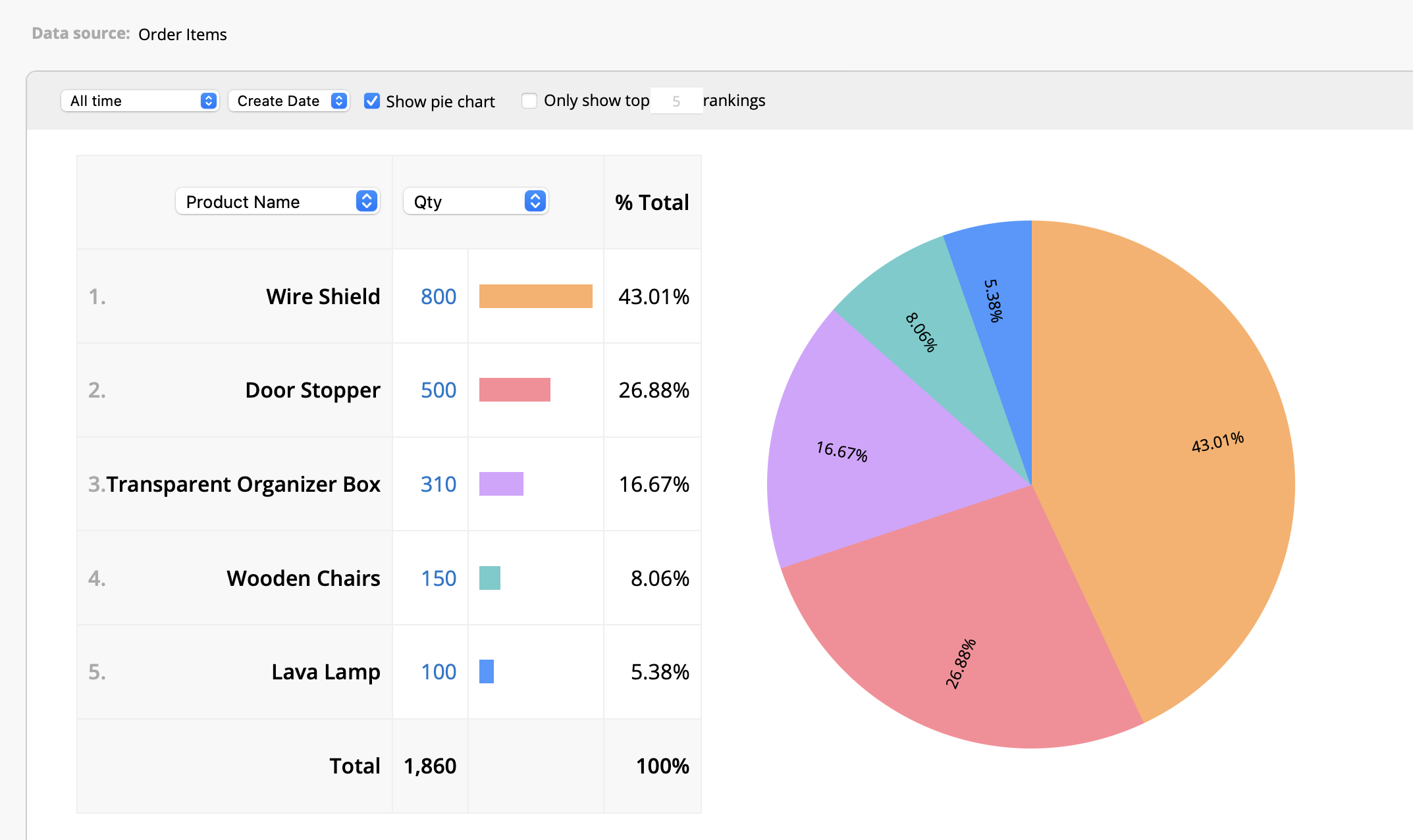
If you wish to view the sales volumes in relative proportions to each other, you can also select the Pie Chart option to visually represent the sales volume of each product.
There are times that you might need to analyze top performing products based on sales revenue instead of sales volume. Some higher priced products, although sold in smaller quantities, contribute significantly to business revenue and profits, offering different insights compared to sales volume.
If you want to analyze product sales based on revenue, simply switch "Quantity" to "Subtotal" in the Ranking Report:
The Ranking Report allows you to toggle between sales volume and sales revenue ranking. However, if you want to see both these information on the same report interface without switching back and forth, you can use a Grouping Report, which can simultaneously display multiple fields.
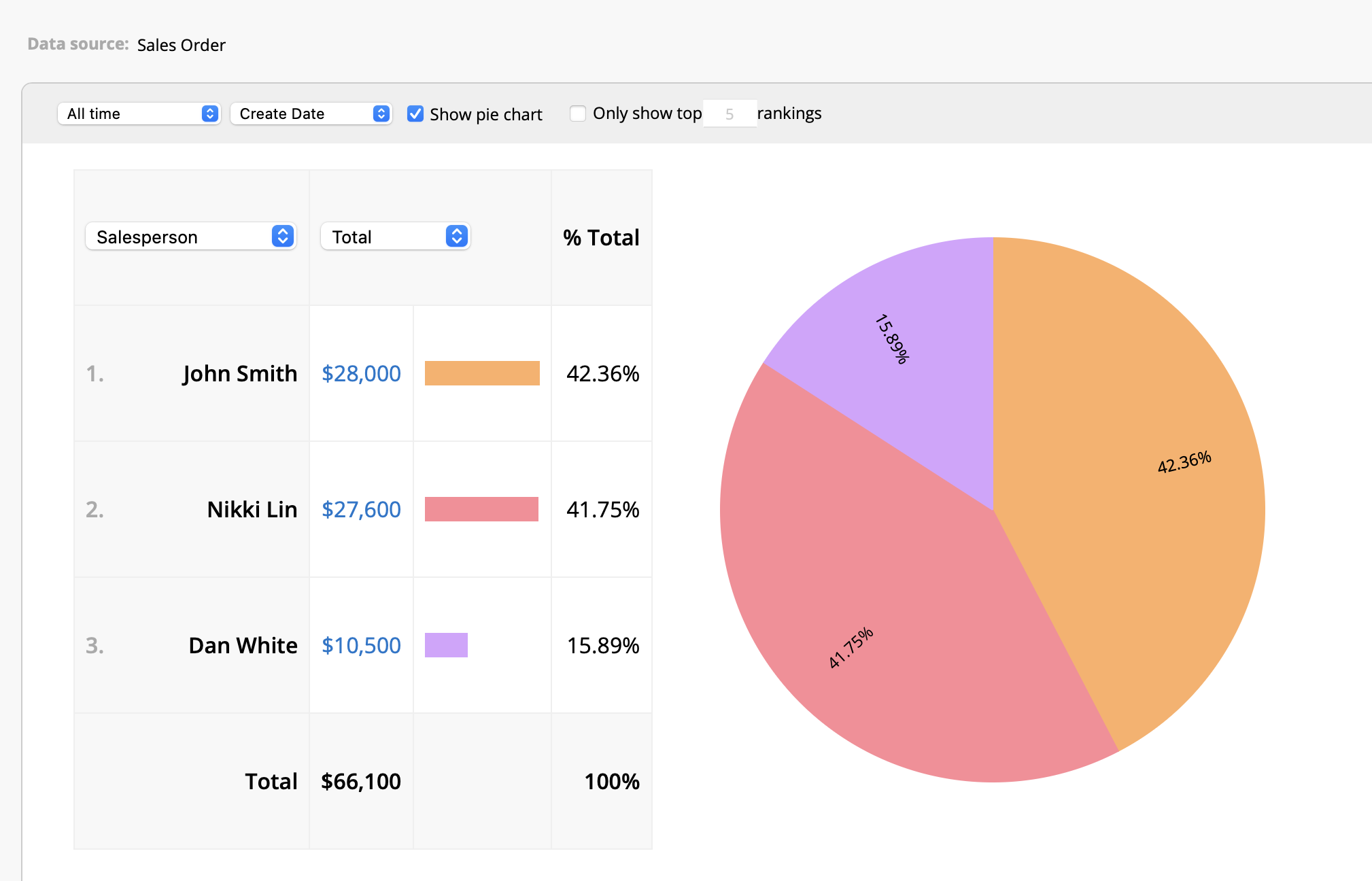
Other than analyzing product sales by volume and by revenue, you can also use the Ranking Report in determining which salesperson had the best performance. Simply change the ranking field to the "Salesperson" field:
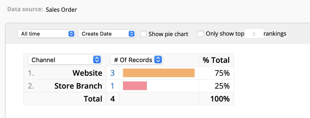
If your products are sold through both physical stores and e-commerce channels and you want to use reports to determine which channel performs best, you can use the Ranking Report to analyze the "Channel" field.
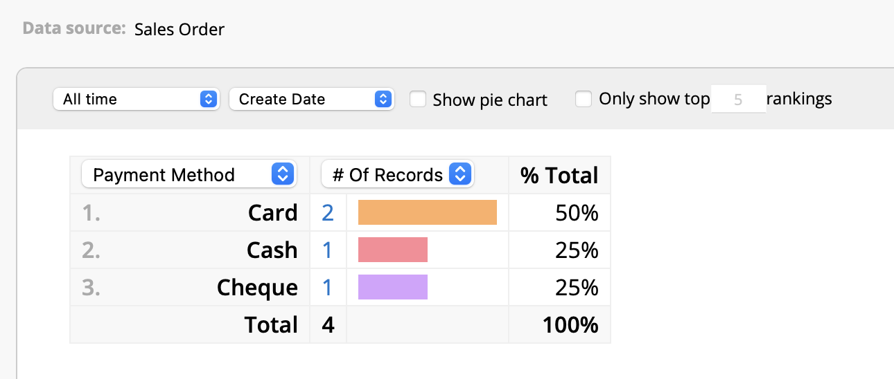
If you want to determine which payment method customers use most frequently, you can display the payment method data using a Ranking Report as well.
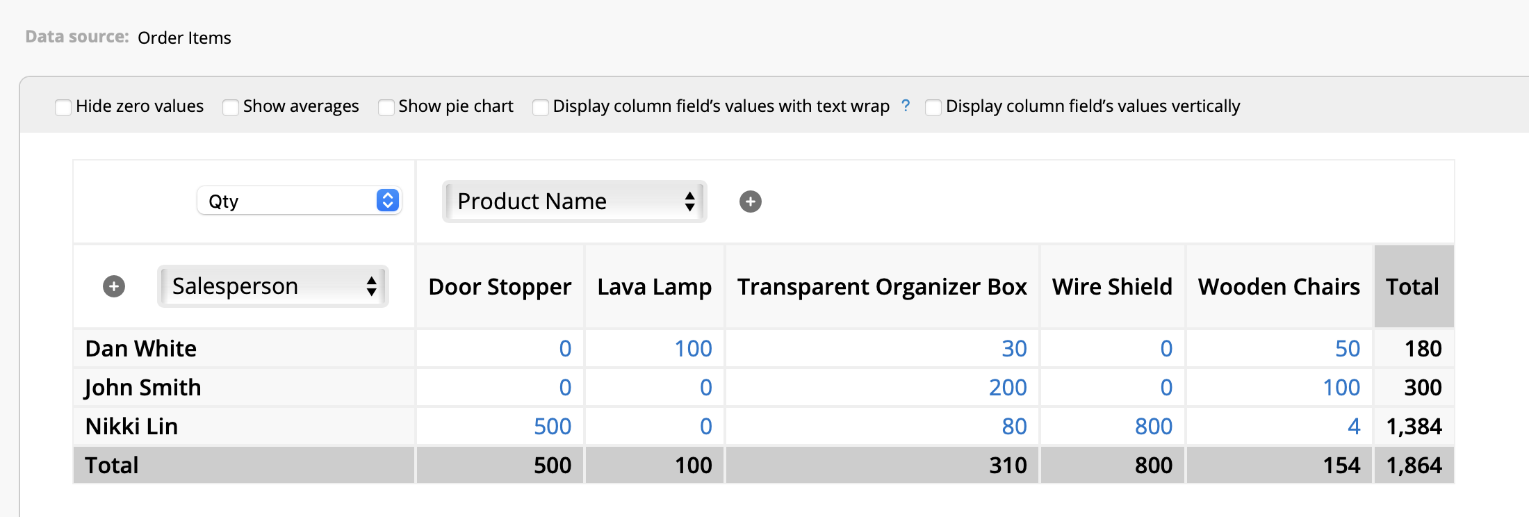
If you wish to have more detailed insights beyond the sales contribution of each salesperson and wish to compare their product sales performance, we would recommend utilizing the Pivot Table.
Pivot Table allows you to set multiple conditions on the horizontal and vertical axes to analyze data. To view the sales volume of multiple products of each salesperson, you can set the horizontal axis to "Salesperson" and the vertical axis to "Product Name".
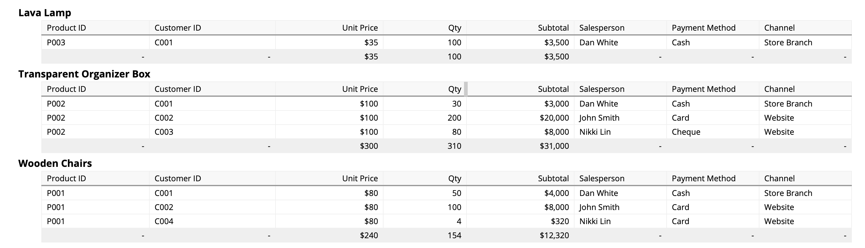
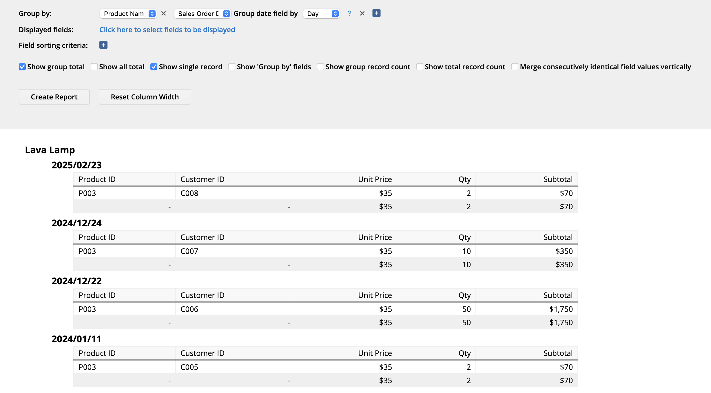
If you’re looking for a more detailed breakdown across multiple fields, consider using a Grouping Report. For example, if you want to see the specific products sold by each salesperson and the order information in which the products were sold, you can set the "Grouping Fields" to "Salesperson" and "Product Name".
In the previous examples with product sales rankings and sales performance contributions, the analyses covered all time periods. However, in practice, we often need to view data for specific time periods, such as sales for a particular month or quarterly sales performance rankings. This allows us to compare performances across different timeframes.
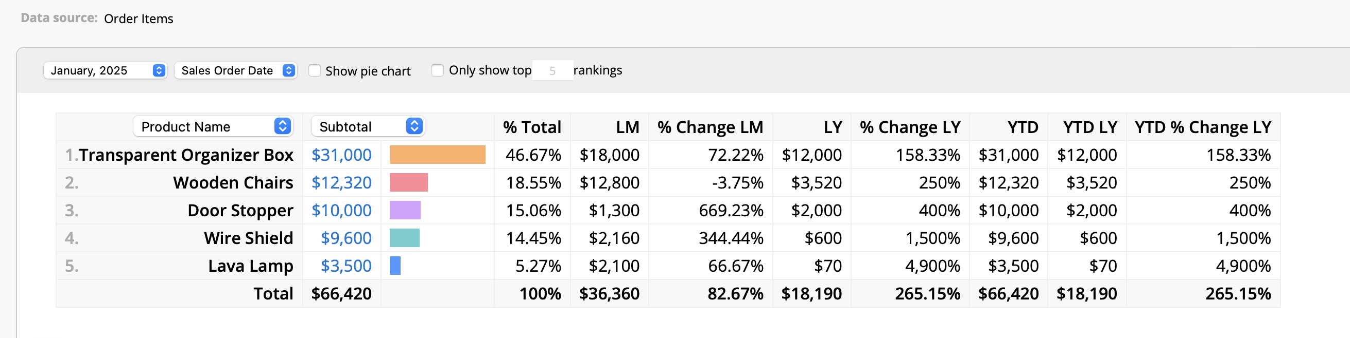
In the Ranking Report, you can set the time period in the upper left corner. The system will show data for the specified period, as well as the changes compared to previous periods.
For example, if you would like to view the sales revenue for January this year, set the month to January 2025 in the upper left corner. The Ranking Report will automatically generate a comparison with both December 2024 (the previous month) and January 2024 (the same period from the previous year).
However, if you want to set a more flexible start and end time, such as for a quarter or a custom time range, you can consider generating reports for custom time periods.
You can include both the product name and sales order date as "Grouping Fields" to see a list of product sales and revenue across time. You can remove any unnecessary fields from the "Display Fields" settings.
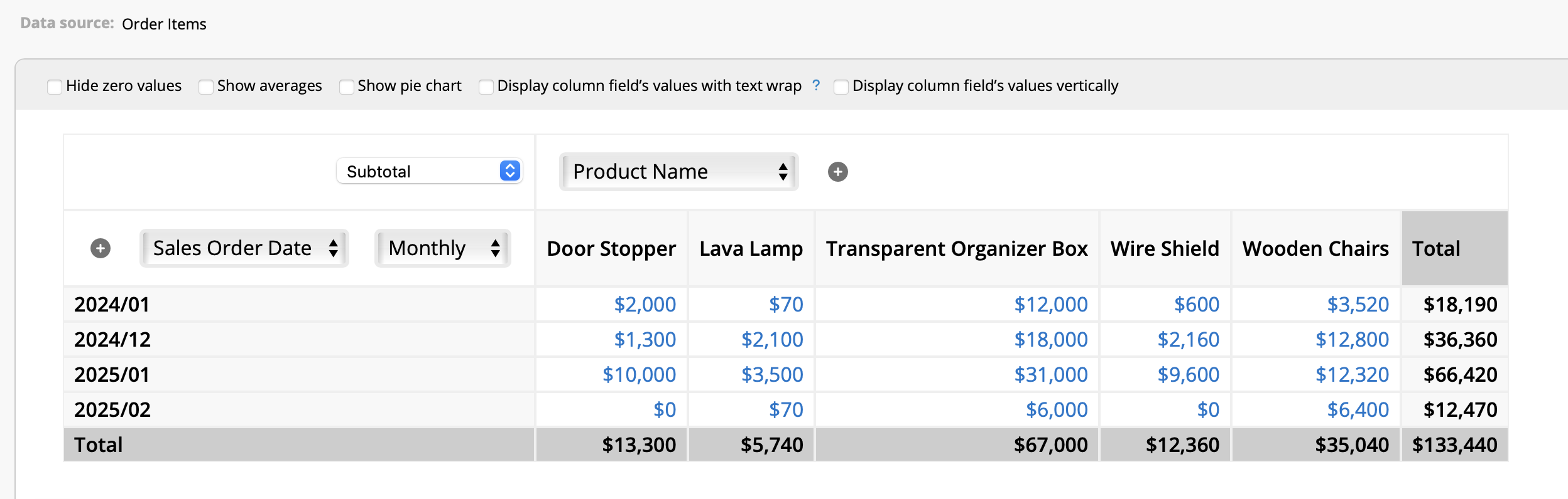
You can also use the Pivot Table and set the column field as "Product Name" and row field as "Sales Order Date". This report can be adjusted further to display the data by month, quarter, week, or day.
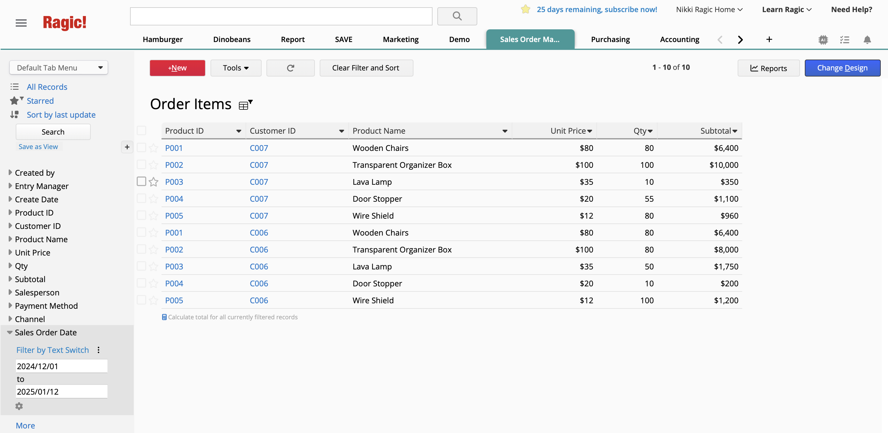
If you wish to generate reports for custom date ranges, such as from December 1 to January 12 of the following year, you can filter the "Order Date" field directly at the top of the report. You can also apply a Shared View to include only records within the desired time range and then generate the report.
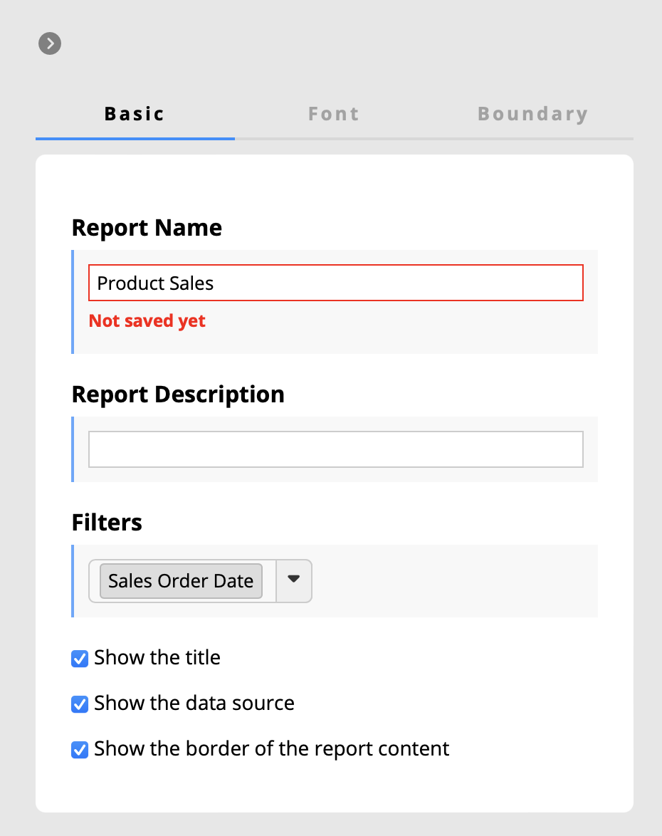
In addition, when saving a report, you can set a filter for the "Order Date" field. After saving, you can define the date range each time you access the report.
While Ranking Reports can display proportions using Pie Charts or show data trends with Line Graphs, these formats only present a single type of chart or analysis. If you want to visually combine and display multiple types of charts and analyses on a single page, you can use Ragic's Widget feature. This allows you to view various data trends at a glance.
For example, if you want to visually present product order quantities, order value trends, and salesperson performance from the "Order Items" sheet on the "Sales Orders" sheet, you can use small charts to display all this information side by side.
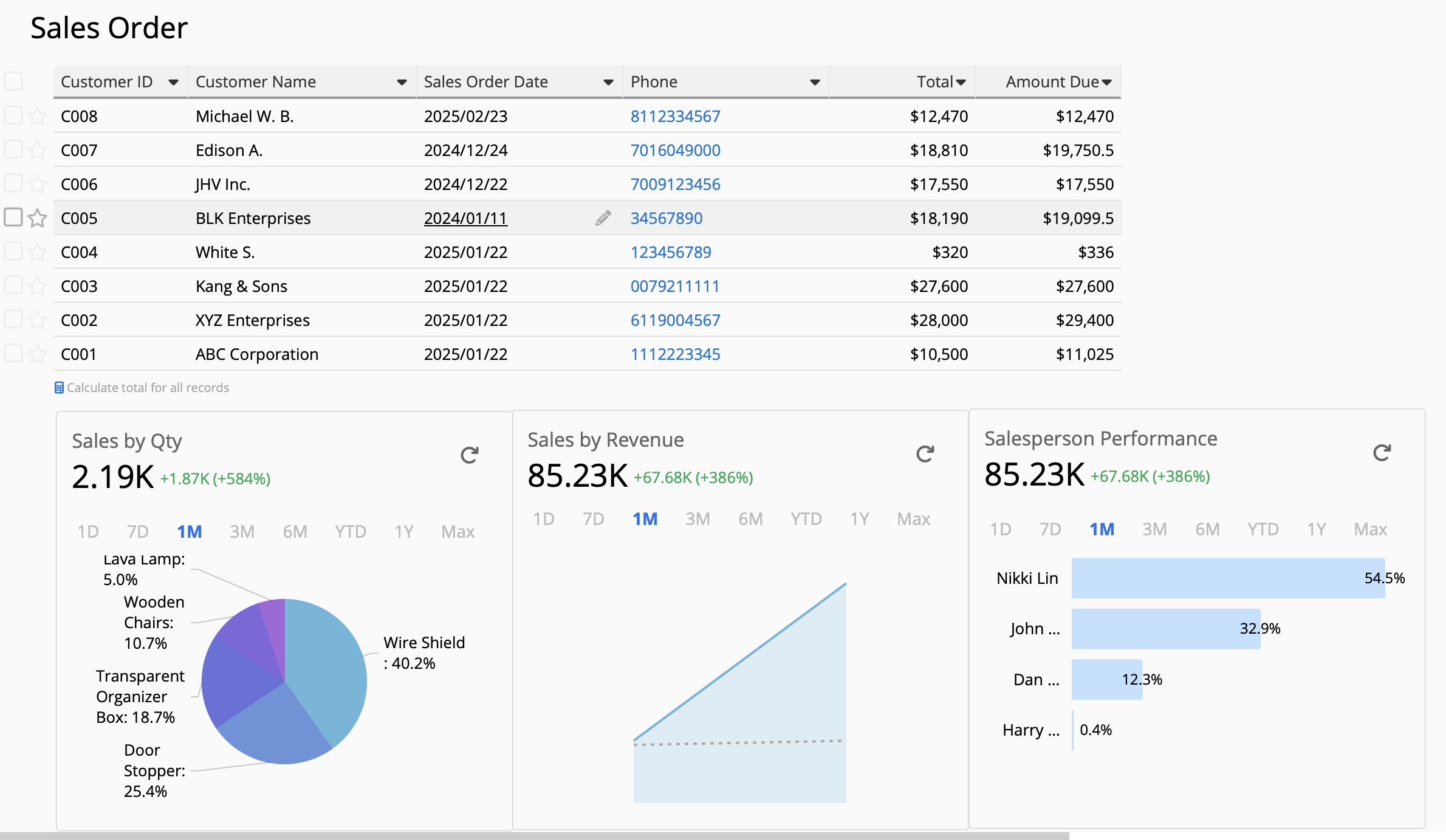
In addition to displaying multiple charts on a single sheet, widgets allow you to display data from other sheets as its data source. Hence, you’re not limited to the data within the current sheet. For example, you can insert data from the "Order Items" sheet as Widgets into the "Sales Orders" sheet, enabling side-by-side information from different sources.
Moreover, the layout is highly flexible– charts can be placed anywhere within the sheet, making this feature extremely convenient and versatile.
 Thank you for your valuable feedback!